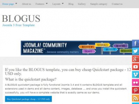
Blogus Free Responsive Joomla! 3 Template is based on the Bootstrap Framework. The Bootstrap Framework makes it fully responsive to all screen resolutions and aspect ratios.
- Compatibility: Joomla! 3, Joomla 2.5, Joomla 1.5.
- Based on Bootstrap.
- Responsive Mobile-Friendly template for Joomla 3. A responsive layout automatically adapts to the viewing device, allowing for an optimized appearance on multiple devices, such as tablets.
- Template Bundle Package.
- CSS Superfish multi level dropdown menu.
- Responsive Menu.
- jComments support and jComment theme (available only in Qucikstart Package)
- Gallery plugin and modules (available only in Qucikstart Package)
- Client Logos Scroller module, it's allow you can put your client into a folder at your server and it will display your client's logo as scroller. (Client Logos Scroller module available only in Qucikstart Package)
- Google Map module (available only in Qucikstart Package).
- Tableless design and 100% CSS based.
- Lightweight and fast-loading.
- Logo as Text or Image with configuration parameters.
- Built-in 99 Google Fonts. (650 Google Fonts available only in Qucikstart Package).
- Built-in 30+ social media icons for the popular social networking sites including Twitter, Facebook, Google Plus, Youtube, LinkedIn and more...
- 4 layout options: 3 columns (left+component+right), 2 columns (left+component), 2 columns (component + right), 1 column (component).
- 13 Possible Module Positions. All module positions are fully collapsible
- Support for Sitemap - Xmap component.
- Cross-Browser Support - Allerta template work great with all modern browsers like Firefox, Chrome, Safari, Opera and Internet Explorer 9+.
- SEF Optimised Layout.
- Heading: h1, h2, h3, h4 and h5.
- Optimized code for Search Engines which helps in SEO.
Tags
Blog Personal Social Bootstrap ModernPowered by Phoca Cart